
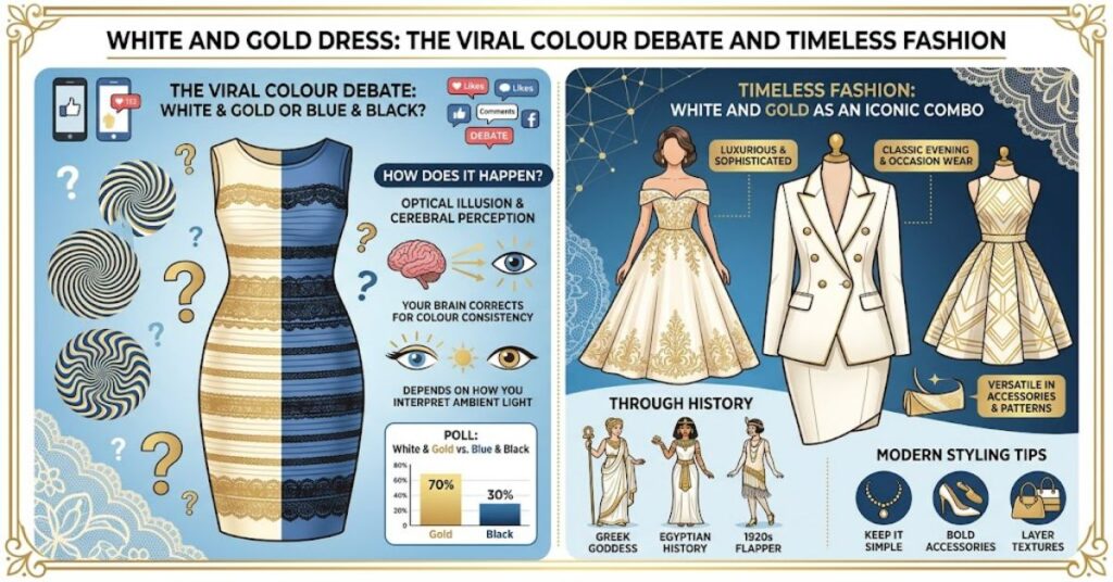
The white and gold dress is remembered for one of the internet’s most famous visual debates. In February 2015, a photograph of a striped dress spread across social media, dividing viewers into two camps. Some people saw white and gold, while others insisted the dress was blue and black. The argument became a global talking point and raised questions about how the human brain interprets colour.
The photograph showed more than a disagreement over clothing. It highlighted the role of illumination, visual context and individual perception in how people understand an image. Although the viral debate brought the dress to worldwide attention, it also gave the white-and-gold colour combination a lasting place in popular culture.
In fashion, these colours have a different appeal. White can suggest simplicity, freshness and refinement, while gold introduces warmth, shine and a sense of occasion. Together, they work across bridal gowns, evening dresses, cocktail outfits and accessories. The result depends on the shades, fabrics and proportions chosen.
Understanding both sides of the story helps explain why this colour pairing remains interesting. The viral photograph is a useful example of visual perception, while the fashion combination offers practical styling possibilities. Whether someone is searching for the original dress controversy or inspiration for a formal outfit, the key is to distinguish the photograph’s perceived colours from the actual garment and the wider appeal of white and gold.
Why Did People See Different Colours in the Same Dress?
The viral photograph became a scientific talking point because it exposed a process called colour constancy. The human visual system tries to estimate an object’s surface colour despite changes in the light falling on it. This ability helps us recognise familiar objects in sunlight, shade and indoor lighting.
The difficulty arises when a photograph provides unclear information about its illumination. Viewers must make assumptions about the light source, and those assumptions can change how they interpret the same pixels.
Research published in Current Biology by Lafer-Sousa, Hermann and Conway (2015) found substantial differences in how people matched the dress’s colours. Some viewers reported white and gold, others blue and black, and some described intermediate shades.
A later study by Talbert and Patel (2016) examined early visual processing and found differences between the groups, including an association between macular pigment density and reported colour perception. The findings suggest that the effect involves more than a simple disagreement about lighting, although they do not provide a complete explanation.
Three factors help explain the controversy:
- Lighting assumptions: Viewers may interpret the image as showing a dress in bluish shade or under warmer illumination.
- Visual processing: The eyes and brain interpret incoming light rather than simply recording fixed colour labels.
- Image conditions: Exposure, surrounding colours, display settings and visual context can affect how a photograph appears.
The important point is that people were not necessarily being dishonest or deliberately choosing different answers. They were interpreting an ambiguous image through their visual systems.
White and Gold Dress in Formal and Bridal Fashion
Away from the viral photograph, white and gold offers a classic fashion combination. White provides a clean base, while gold adds warmth, contrast and decorative detail. Depending on the materials and proportions, the pairing can feel modern, traditional, understated or luxurious.
In bridal fashion, white, ivory and cream are often combined with gold embroidery, metallic thread, beading or jewellery. Eveningwear can use the same palette through a white gown with gold accessories or a gold dress with lighter accents.
The success of the look depends on balance. A heavily embellished gold bodice may work well with a simple skirt, while a plain white dress can support more elaborate jewellery.
| Style | Suggested combination | Best suited to |
| Bridal | Ivory gown with gold embroidery | Weddings and formal ceremonies |
| Eveningwear | White satin dress with gold accessories | Dinners and celebrations |
| Traditional occasionwear | White fabric with gold detailing | Cultural events and receptions |
| Minimalist | White dress with subtle gold jewellery | Day-to-evening outfits |
| Statement look | Gold dress with white accents | Parties and special occasions |
Fabric matters as much as colour. Satin reflects light and can make gold accents appear brighter, while matte crepe creates a softer contrast. Lace and embroidery introduce texture, which can make a simple colour pairing look more detailed without adding more colours.
How to Style White and Gold Successfully
A balanced outfit usually works better than treating both colours as equally dominant. White can provide the main structure, with gold used for jewellery, shoes, a belt, embroidery or a clutch bag.
Consider these practical points when choosing an outfit:
- Match the undertones: Ivory and champagne gold often create a warmer look, while crisp white and pale gold can feel cooler and more contemporary.
- Consider the occasion: Subtle metallic accents suit daytime events, while richer gold details can work for evening celebrations.
- Check the lighting: Warm indoor lighting can make gold appear deeper and cream fabrics more yellow. Natural daylight may reveal different undertones.
- Think about texture: Satin, sequins and metallic embroidery reflect light differently, so combining several shiny materials can make an outfit feel visually busy.
- Choose accessories carefully: Gold jewellery complements the palette, but matching every accessory exactly is not essential.
One useful distinction is that a colour combination that looks elegant in person may photograph differently. Camera exposure, white balance and surrounding light can shift how white fabric and metallic details appear on screen. This is a practical reason to check formalwear in the lighting where it will be worn and photographed.
The Future of White and Gold Dress Fashion in 2027
White and gold is likely to remain a useful option for bridalwear and formal occasions because it combines a neutral base with decorative warmth. However, specific trends for 2027 will depend on designers, regional preferences, budgets and changing ideas about occasionwear.
Personalised styling may also influence how people approach the combination. Brides and event guests can choose between minimal accessories, detailed embroidery and more dramatic metallic finishes without abandoning the basic palette.
Digital shopping presents a practical challenge. Screens cannot always reproduce fabric colour, texture and metallic reflection accurately. Product photographs should therefore be treated as guides rather than guarantees. Clear descriptions, fabric details and reliable return policies can help buyers make better decisions.
There is no basis for claiming that the viral colour debate itself will determine fashion trends in 2027. Its cultural importance is separate from the commercial popularity of white and gold clothing.
Key Takeaways
- The original viral dress was blue and black, despite appearing white and gold to many viewers.
- Colour constancy helps explain why the same photograph can produce different perceptions.
- Visual context and individual differences both contribute to how people interpret colour.
- White and gold works across bridalwear, eveningwear and traditional occasionwear.
- Fabric, undertone and lighting influence how the combination appears in person and in photographs.
- Online shoppers should consider the limits of screen-based colour reproduction before purchasing formalwear.
Conclusion
The white and gold dress occupies two distinct places in popular culture. In 2015, a photograph sparked an international debate about visual perception, demonstrating how differently people can interpret the same image. In fashion, white and gold remains an elegant pairing that can suit everything from bridal gowns to understated evening outfits.
The scientific story is more complex than a simple disagreement over colour. The brain uses clues about illumination and context to interpret what the eyes receive, and ambiguous images can produce different but genuine perceptual experiences.
The fashion story is equally practical. The balance between white and gold depends on fabric, texture, accessories and the setting in which an outfit will be worn. Careful choices can create a refined look without excessive decoration.
Both meanings reveal something useful about colour: its appearance depends on context. Whether interpreting a photograph or choosing an outfit, understanding that relationship helps explain why the same combination can inspire different reactions.
Frequently Asked Questions
1. What was the actual colour of the viral white and gold dress?
The original dress was blue and black. The photograph’s lighting and visual ambiguity led many viewers to perceive it as white and gold.
2. Why did people see the dress in different colours?
People made different assumptions about the illumination in the photograph. Colour constancy, visual processing and image conditions contributed to the different perceptions.
3. Is white and gold a good combination for formalwear?
Yes. White provides a neutral foundation, while gold adds warmth and decorative detail. The pairing works well for weddings, receptions and evening events.
4. What accessories go with a white dress and gold details?
Gold earrings, a delicate necklace, metallic shoes or a small clutch can complement the outfit. The best choice depends on the dress’s embellishment and the occasion.
5. How can I choose the right shade of white and gold?
Consider the fabric’s undertone and the lighting where you will wear it. Ivory often pairs naturally with champagne gold, while bright white can suit paler metallic shades.
6. Can a white and gold dress look different in photographs?
Yes. Exposure, white balance, lighting and screen calibration can change the appearance of white fabric and gold details. Check the garment in person when possible.
References
Lafer-Sousa, R., Hermann, K. L., & Conway, B. R. (2015). Striking individual differences in color perception uncovered by ‘the dress’ photograph. Current Biology, 25(13), R545–R546.
Talbert, C., & Patel, R. (2016). Blue-black or white-gold? Early stage processing and the color of ‘The Dress’. PLOS ONE, 11(8), e0161090.
Methodology
This article draws on published vision-science research about the viral dress and applies general fashion principles to formalwear styling. The scientific discussion distinguishes established findings from explanations that remain incomplete. Styling recommendations are practical guidance, not the results of a garment-testing study.
The cited research is genuine, but an editor should verify the final APA details and confirm that the original sources support the claims before publication. No firsthand garment testing or original audience survey was conducted for this article.
This article was drafted with AI assistance and should be reviewed and fact-checked by a human editor before publication on Matrics360.com.